Building a Scalable Design System for Digital Banking
Cut design redundancy 30% and development handoff time 25%, scaling to four banking product surfaces.
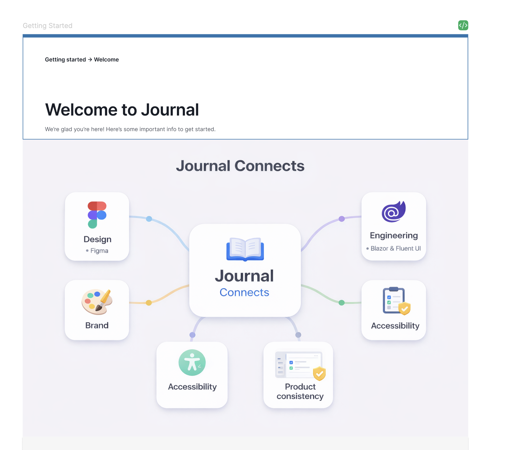
Established Dollar Bank's first enterprise-grade design system — Journal — defining token foundations, component architecture, and governance practices that unified design and engineering across the organization.
ClientDollar Bank
Role / ServicesDesign system lead, component architecture, governance
Dollar Bank's digital products were built by multiple teams using inconsistent UI patterns, duplicated components, and informal handoff processes. Every sprint produced slightly different buttons, forms, and layouts — slowing delivery and eroding trust in the product's consistency.
Methodology
How the work moved
01
Audited existing UI across online banking, mobile, and internal tools to identify redundancy and misalignment between design files and production code.
02
Built a token-first foundation covering color, spacing, typography, elevation, and motion — mapped directly to Blazor and Fluent UI engineering constraints so components could be implemented without reinterpretation.
03
Authored governance documentation, component contribution guides, and naming conventions — then ran cross-team workshops to drive adoption across product, design, and engineering.
Key Decisions
Decisions and tradeoffs
Audited existing UI across online banking, mobile, and internal tools before building anything new.
Alternatives considered
[NEEDS INPUT: alternatives considered]
Why I chose this
To identify redundancy and misalignment between design files and production code before committing to a component architecture.
What I would do differently
[NEEDS INPUT: what I would do differently]
Built a token-first foundation mapped directly to Blazor and Fluent UI engineering constraints, rather than defining tokens in design isolation.
Alternatives considered
[NEEDS INPUT: alternatives considered]
Why I chose this
So components could be implemented without reinterpretation by engineering.
What I would do differently
[NEEDS INPUT: what I would do differently]
Authored governance documentation and contribution guides, then ran cross-team workshops, rather than publishing the library and leaving adoption to chance.
Alternatives considered
[NEEDS INPUT: alternatives considered]
Why I chose this
To drive adoption across product, design, and engineering.
What I would do differently
[NEEDS INPUT: what I would do differently]
Results and Impact
What changed
Reduced design redundancy by 30% within the first two quarters of adoption.
Cut development handoff time by 25% through shared token language and documented component behavior.
Scaled the system to cover account summary, loan servicing, account opening, and HELOC experiences — with ongoing expansion.
The System
Journal
A token-first design system for regulated digital banking — built so a decision made once in Figma resolves the same way in Blazor, Storybook, and production.
3Token tiers
8Foundation scales
5Atomic levels
4Product surfaces
01 — Token architecture
Three tiers, one source of truth
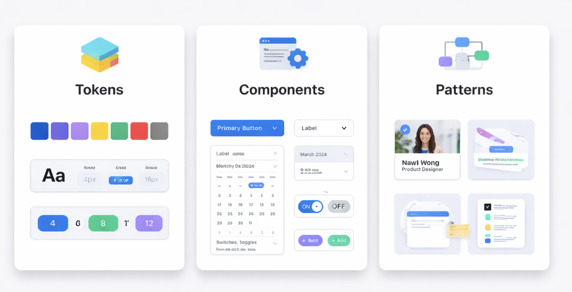
Primitives hold raw values. Semantic tokens assign meaning. Component tokens bind meaning to a specific part. Only the primitive tier ever holds a hex value, so rebranding or theming touches one layer.
Primitivebrand.500 = #1f66bd
Raw, context-free values. Never referenced directly by a component.
→
Semanticaction.primary.bg = brand.500
Assigns intent. This is the layer product designers actually speak in.
→
Componentbutton.primary.bg = action.primary.bg
Binds intent to a part, so a component can deviate without a fork.
02 — Color
Ramps and semantic mapping
Representative ramps shown here: the production palette is Dollar Bank brand property. Every step is checked against WCAG contrast pairs before it enters the system.
Brand ramp
brand.50#eef4fb
brand.100#d5e4f5
brand.200#abc9ea
brand.300#7aa8dc
brand.400#4a86cd
brand.500#1f66bd
brand.600#17529a
brand.700#123e75
brand.800#0d2b51
brand.900#07192f
Neutral ramp
neutral.0#ffffff
neutral.50#f7f8f9
neutral.100#eceef1
neutral.200#dcdfe4
neutral.300#b9bfc7
neutral.400#8b939e
neutral.500#646c78
neutral.600#4a515b
neutral.700#343a42
neutral.800#21262c
neutral.900#12161a
Feedback
success#1f7a4d
warning#b4700d
error#b3261e
info#1f66bd
Semantic mapping
surface.page→neutral.50
surface.raised→neutral.0
text.primary→neutral.900
text.secondary→neutral.500
border.subtle→neutral.200
action.primary.bg→brand.500
action.primary.fg→neutral.0
feedback.error.fg→error
03 — Typography
One ramp, fixed line heights
Eight steps cover every product surface. Sizes and line heights are locked to the scale so vertical rhythm survives contribution from four separate teams.
display40 / 600 · 1.15
Clarity at every scale
heading-132 / 600 · 1.20
Clarity at every scale
heading-224 / 600 · 1.25
Clarity at every scale
heading-320 / 600 · 1.30
Clarity at every scale
body-lg18 / 400 · 1.60
Clarity at every scale
body-md16 / 400 · 1.60
Clarity at every scale
body-sm14 / 400 · 1.55
Clarity at every scale
caption12 / 500 · 1.40
Clarity at every scale
04 — Spacing, radius, elevation
A 4-point base everything snaps to
Spacing is the token developers reach for most, so the scale is short enough to memorise and strict enough to prevent one-off values.
Spacing scale
space-14px
space-28px
space-312px
space-416px
space-624px
space-832px
space-1248px
space-1664px
Radius
radius-xs
radius-sm
radius-md
radius-lg
radius-full
Elevation
elevation-0
elevation-1
elevation-2
elevation-3
05 — Iconography
One grid, one stroke weight
Drawn on a 24px grid at a 1.75px stroke, so icons hold their weight beside body text without optical correction.
Account
Transfer
Card
Secure
Insight
Alert
Search
Settings
06 — Atomic structure
From token to production screen
Atomic Design gave the organisation a shared vocabulary for scope. It made contribution reviewable: everyone could agree what level a change belonged to before arguing about the change itself.
01Atoms
Color tokens · Type styles · Icons · Buttons · Inputs · Labels
02Molecules
Form fields · Search bar · Pagination · Card header · Alerts
03Organisms
Account card · Data table · Navigation · Transaction list
Components ship with their full state matrix. An unspecified state is where two teams invent two different answers — so hover, focus, disabled, error and loading are all part of the contract.
Buttons · variants
Buttons · states
DefaultHoverFocusDisabled
Form field · states
021000021
9 digits, found on your cheque
021000021
Focused
02100
Enter all 9 digits
Selection controls
Paperless statementsMailed statementsCheckingSavingsAlerts onAlerts off
Feedback
Your transfer is scheduled for the next business day.
Payment posted to your account.
Verification expires in 3 days.
We could not reach your linked account.
PendingPostedReviewFailed
Data display
AccountTypeStatusBalance
Everyday CheckingDepositPosted$4,280.10
Reserve SavingsDepositPending$18,904.55
Home Equity LineCreditReview$62,000.00
08 — Governance
A system is a practice, not a file
Adoption held because contribution had a route. Anyone could propose; the path from proposal to released token was documented, reviewable, and versioned.
Propose
Any team opens a request against a real product need, not a hypothetical.
Review
Design and engineering assess it together — naming, accessibility, and build cost in one pass.
Build
Token, Figma component, and Blazor implementation land together or not at all.
Release
Semantic version, changelog, and migration note published to Storybook.