Dollar Bank Accounts Dashboard
The goal was to design an intuitive dashboard for Dollar Bank that enables customers to effortlessly manage their finances, encompassing account management, money transfers, Zelle transactions, and spending evaluation. This dashboard is crucial for providing users with a comprehensive understanding of their financial health and facilitating quick actions.
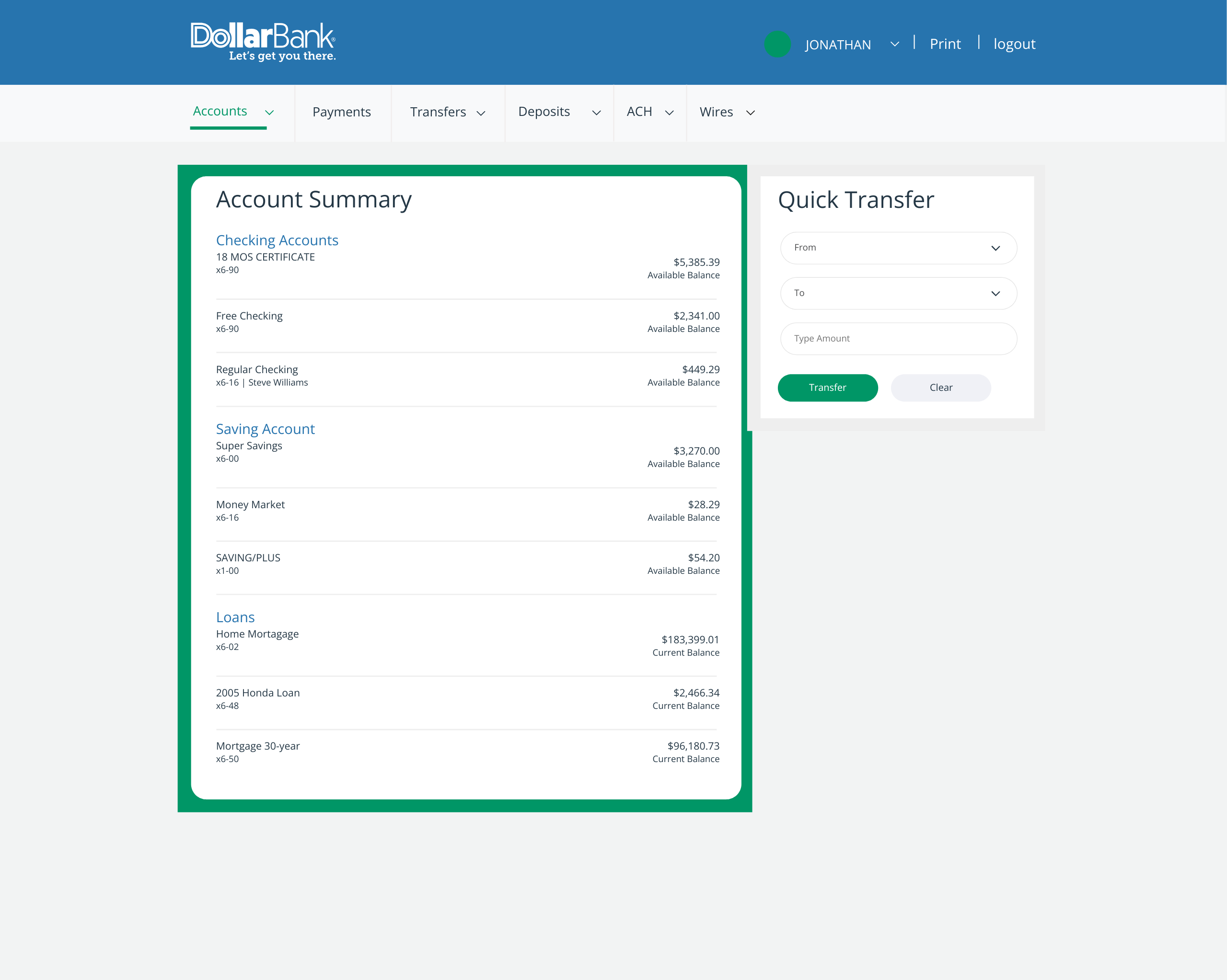
Problem Statement
The existing accounts dashboard faced several usability challenges that affected user satisfaction:
- Information Overload: Customers found the dashboard to be cluttered, with too much information presented in a non-organized manner, leading to confusion.
- Difficult Navigation: Key features such as quick transfers and spending evaluation were hard to locate, causing delays in completing transactions.
- Inconsistent Design Language: Varying formats for displaying balances, transactions, and other data created a disjointed user experience.
- Limited Insights into Financial Health: Users struggled to evaluate their spending patterns and savings goals due to a lack of visual aids and analytics.
- Security and Privacy Concerns: Users wanted clear information regarding the security of their transactions, particularly with Zelle features.
Solution Overview
To address these issues, I implemented a series of design enhancements:
1. Streamlined Information Architecture
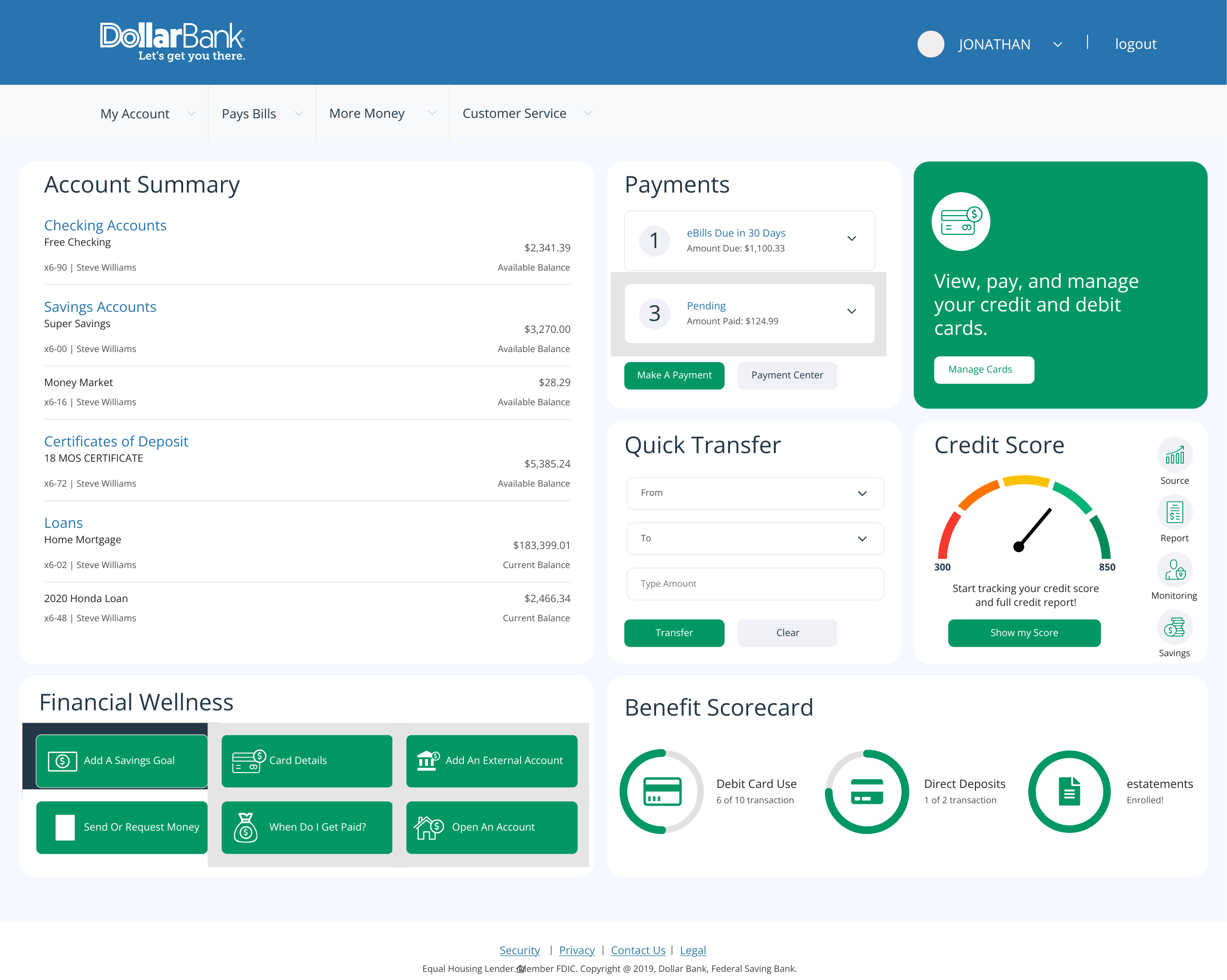
- Categorized Sections: Divided the dashboard into intuitive sections such as Account Summary, Payments, Quick Transfers, and Financial Wellness. This allowed users to easily find the tools they needed without feeling overwhelmed.
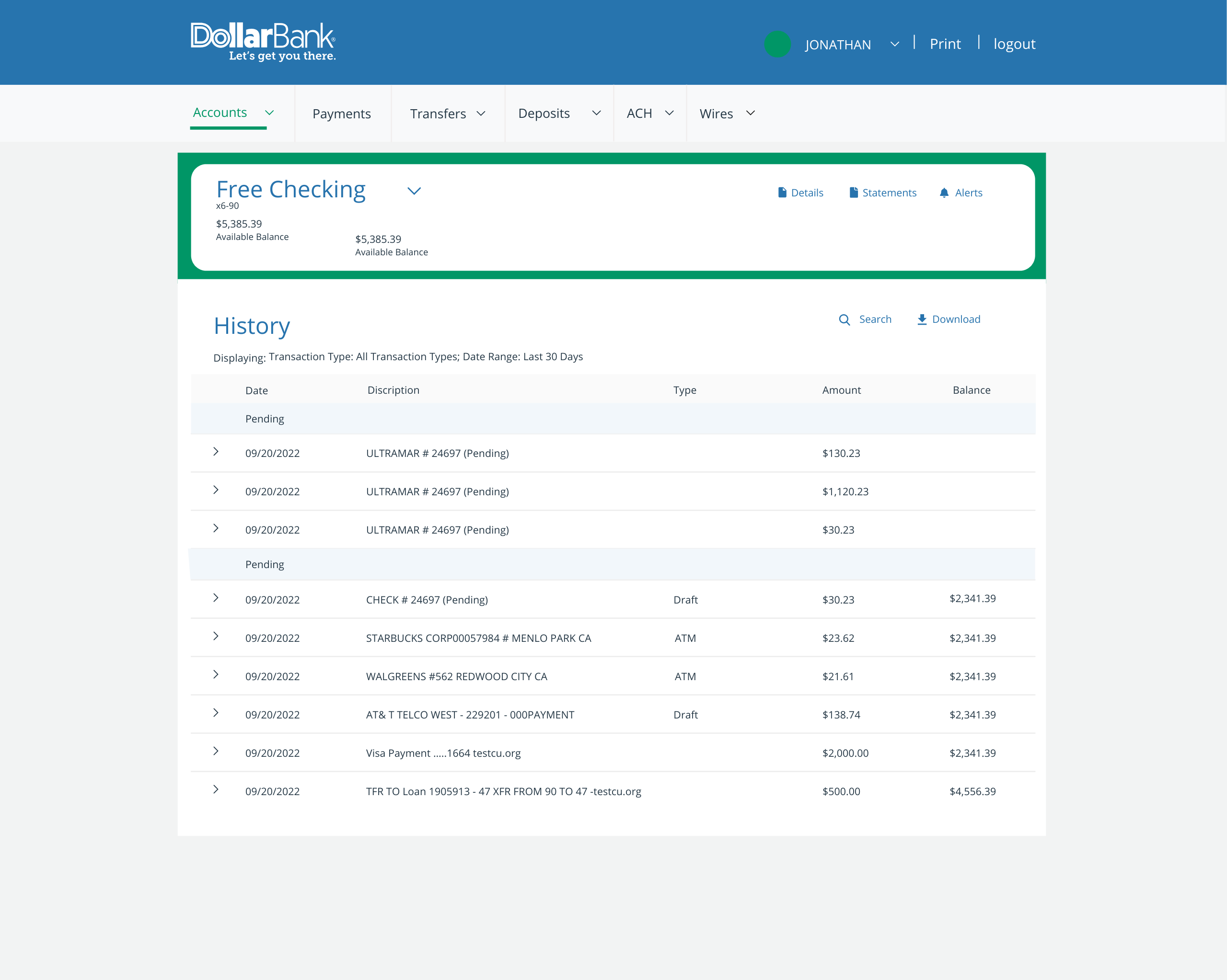
- Dashboard Overview: Created a summary panel that highlights critical information like available balances and recent transactions, giving users a quick snapshot of their financial status.
2. Enhanced Navigation
- Prominent Action Buttons: Placed clear, actionable buttons for key tasks (e.g., "Make a Payment," "Transfer," "Manage Cards") at the top of the dashboard, ensuring they are easily accessible.
- Dedicated Zelle Section: Introduced a dedicated area for Zelle transactions that highlights sending or requesting money, making this popular feature front-and-center.
3. Consistent Design Language
- Standardized Text and Icons: Utilized a consistent color scheme, typography, and iconography throughout the dashboard to enhance visual cohesion and reduce cognitive load.
- Uniform Balance Displays: Implemented a unified format for displaying account balances across various account types, making it easier for users to compare values.
4. Improved Insights and Analytics
- Spending Evaluation Tools: Integrated graphical representations (e.g., pie charts or bar graphs) to visualize spending categories and trends over time, helping users understand their financial behavior better.
- Savings Goals Tracker: Added functionality for users to set and track savings goals, enhancing their ability to plan and manage their finances effectively.
5. Enhanced Security Features
- Visible Security Information: Included clear messaging about security measures in place for transactions, particularly for Zelle, reassuring users about the safety of their financial activities.
- Alerts for Transactions: Implemented alerts for significant transactions, keeping users informed and enhancing the security of their accounts.
Results and Impact
User Feedback and Usability Testing
- Higher User Satisfaction: Post-launch surveys indicated a 40% increase in user satisfaction regarding the dashboard's ease of use and visual layout.
- Increased Transaction Speed: Usability testing revealed that users could complete transactions 25% faster, thanks to improved navigation and clear action buttons.
- Greater Engagement with Financial Tools: A 60% increase in the usage of financial wellness tools (like spending evaluations and savings goals) was observed in the months following the redesign.
Performance Metrics
- Reduction in Customer Support Queries: There was a 20% decrease in support inquiries related to navigation and account management, indicating that users were able to find the information they needed more effectively.
- Enhanced Security Perception: Users reported greater confidence in conducting transactions, specifically mentioning the clear security messaging as a factor in their trust.
Conclusion
The UX redesign of the Dollar Bank accounts dashboard successfully addressed key challenges faced by users in managing their finances. By implementing a streamlined information architecture, enhancing navigation, ensuring consistent design, providing better insights into financial health, and emphasizing security, the dashboard has transformed into a powerful tool for customers.