Dollar Bank Account Summary Redesign
The goal was to create a clean, personalized interface that simplifies everyday banking tasks, offers dynamic financial insights, and ensures a seamless mobile experience. By focusing on user-centric design, the redesigned page empowers customers to quickly understand their finances and engage with additional banking services.
Problem Statement
The existing Account Summary Page presented several challenges:
- Cluttered Interface: An overload of information made it difficult for users to quickly locate the details they needed.
- Lack of Personalization: The page felt generic, failing to reflect users’ individual banking priorities.
- Poor Mobile Experience: The design was not optimized for mobile, frustrating users who bank on the go.
- Low Engagement with Services: Customers were either unaware of or disengaged from additional banking services like credit score monitoring, CD renewals, and personalized financial insights.
Process
1. Research and Discovery
- Stakeholder Workshops: Collaborated with Dollar Bank leadership and product teams to align on business goals, technical constraints, and user needs.
- Customer Interviews: Conducted in-depth interviews with 20+ customers to uncover pain points, behaviors, and expectations.
-
User Personas: Developed three primary personas:
- The Busy Professional: Needs quick access to balances and transactions.
- The Savvy Saver: Focuses on tracking savings goals and exploring investments.
- The Mobile-First User: Prioritizes seamless mobile banking.
- Journey Mapping & Empathy Mapping: Mapped customer journeys to identify friction points and understand user emotions, motivations, and frustrations.

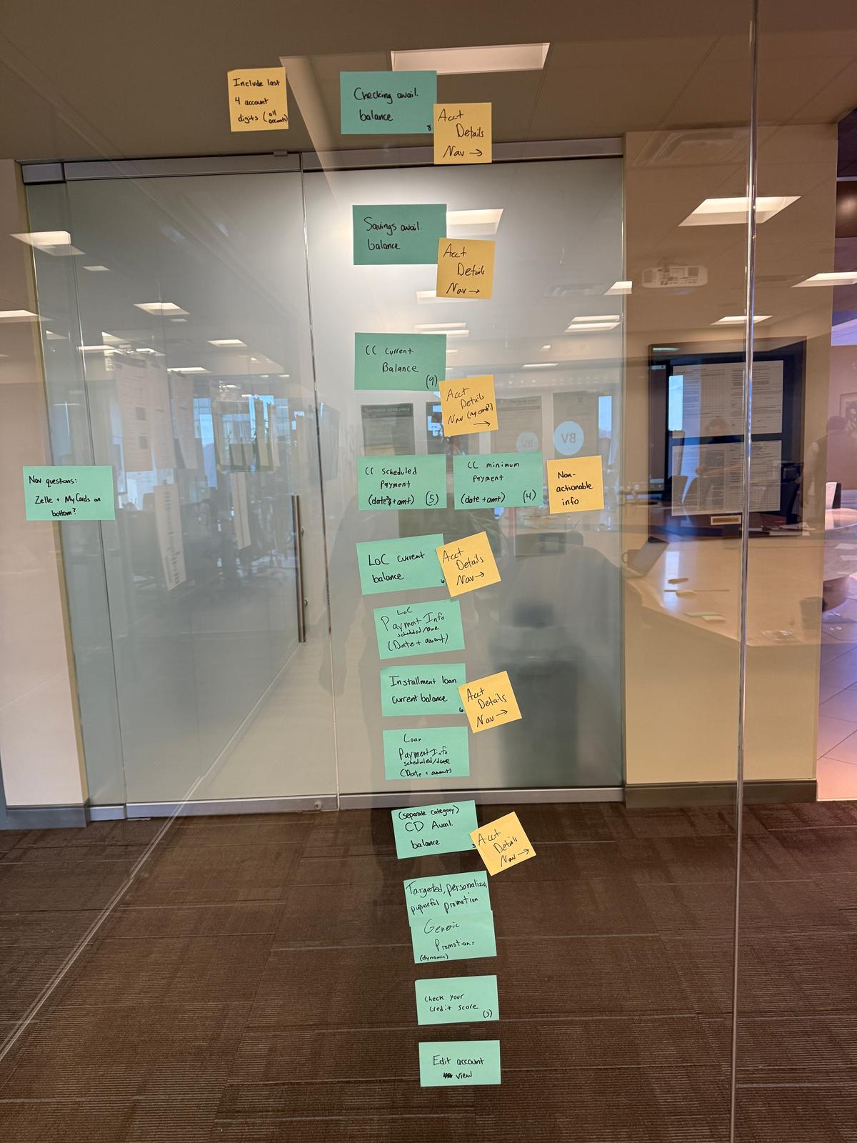
2. Ideation and Sketching
- Crazy 8s Exercise: Held rapid sketching sessions with stakeholders to generate innovative ideas for layout and features.
- Prioritization: Selected the most promising ideas with an emphasis on simplicity, personalization, and mobile responsiveness.
3. Design and Prototyping
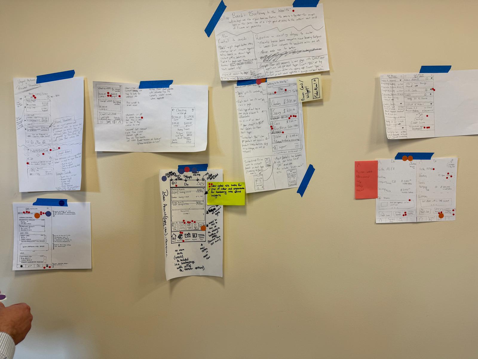
- Wireframes: Developed low-fidelity wireframes outlining a clean, organized structure for the new page.
-
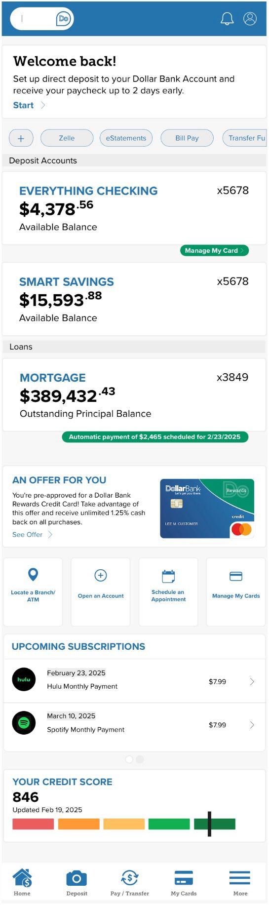
High-Fidelity Prototype: Created a detailed Figma prototype, incorporating stakeholder and user feedback. Key design elements included:
- Account Overview: A prioritized view of various account types with quick access to details.
- Personalized Insights: Dynamic content displaying spending trends, credit updates, and tailored savings goals.
- Promotional Banners: Strategically placed banners to highlight services like CD renewals and financial planning tools.
- Responsive Design: Ensured a fully optimized mobile experience with a collapsible menu and touch-friendly interactions.
4. Testing and Iteration
- Usability Testing: Conducted sessions with 10+ customers to gather actionable feedback on the prototype.
- Iterative Refinements: Adjusted elements such as font size, button placement, and navigation flow based on user insights.
Key Features of the Redesign
- Simplified Layout: Reduced clutter by grouping related information and incorporating collapsible sections for less frequently accessed details.
- Personalized Content: Delivered dynamic insights tailored to individual user behaviors, including spending trends and financial tips.
- Mobile-First Design: Prioritized a responsive, intuitive mobile experience with larger touch targets and streamlined navigation.
- Service Promotions: Integrated subtle promotional elements to drive engagement with additional banking services.
Results
- Improved Usability: Post-launch surveys revealed a 35% increase in user satisfaction, with customers praising the streamlined and easy-to-navigate design.
- Higher Engagement: A 25% increase in click-through rates on promotional banners drove more users to explore additional services.
- Mobile Adoption: Mobile banking usage rose by 20% within the first three months following the redesign.
- Stakeholder Approval: Dollar Bank’s leadership commended the project for its user-centered approach and alignment with business goals.
Conclusion
The redesign of Dollar Bank’s Account Summary Page effectively addressed key user pain points, delivering a clean, personalized, and mobile-friendly experience. By leveraging a design sprint methodology that integrated stakeholder collaboration, extensive user research, and iterative design practices, the project not only enhanced usability but also drove higher engagement with essential banking services.